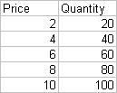
 To arrive at a single line graph here is the procedure to follow. Enter the data into two coulmns of price and quantity as shown. Then select the two columns and click on chart wizard.
 Select XY(Scatter) for Chart type. And the first one without any lines for the sub chart as shown. Click once on "Press and Hold to View Sample" to check whether the X-axis and Y-axis values look as what you are expecting. Then click next and change the X-axis and Y-axis values appropriately for both the series.
Then click on Finish. You get a range of dots which can then be connected by a line. To do this, click on chart and then on a "Add a trend line". Choose automatic and your line graph is ready.


3 comments:
Thank-you! Despite everything I tried, the 'line' graph option in EXCEL (2010) would not allow a single x-versus-y line. Always graphed x and y as two lines against a time interval. This is nice, simple solution!
Thanks a lot. I was wondering how to go about as excel automatically took me to a two line graph. If I do not have a directly proportional data, using the automatic trend line gives me a line in between the data. So I used the scatter with smooth lines and marker. Is that ok?
Thanks a lot . Was wondering how to get a single or get excel to let me define x and y axis to avoid a two line graph. If my data is not linear , I get a trend line in the midst of the data. In such a case , is using the next option of scatter with smooth lines and markers ok? .
Post a Comment