Tuesday, November 22, 2022

Create a Lollipop Chart in Power BI -- Without the use of any Custom Visuals

 I have been playing around with the newly launched Error Bars functionality in Power BI.  The result is this Blog Post.  Here I am going to explain how you can create a lollipop chart in Power BI without using any custom visuals or charticulator or deneb 

Step 1:  

Create a simple line chart -- I have sales data and region data.  So I created a line chart as shown below.


Step 2:  

Format the line chart to remove the line as shown below.  Click on the format icon -- Visual tab -- Line -- Stroke Width -- Change from 3 px to 0


The result of this action is -- the line will entirely disappear as we changed the Stroke Width from 3 px to 0 px.


Step 3:  

Add Markers as shown below and ensure that the shape is a circle resembling the ball of the lollipop and increase the size to 10 px to get reasonable sized balls


The result is as shown below.


Step 4:  
Ensure that the Data Labels are Enabled and choose Position as Above as shown below
You can disable Y-Axis if you need to.  


Step 5:  
Here is where we will be using the Error Bars to add the Line to show the lollipop stick.
To go to the Error Bars section -- Go to the Further Analytics icon and click on Error Bars.
Enable the Error Bars.  As shown below it needs an Upper Bound and Lower Bound.  Upper Bound can be Sum of Sales and the Lower Bound is always 0 (Zero).  Since there is no way to input a number, let us create a Measure that returns 0 .  
The new Measure is -- Lowerbound = 0
 

Step 6:
You can see faint lollipop lines.  You can increase the width of the line by clicking on the Bar and changing the Width as shown below


And Viola!  Your Lollipop chart is ready!

Hope you liked this Step by Step instruction on creating the lollipop chart.


Tuesday, June 28, 2022

Default your Date Slicer to Today with this trick!

 Today I had a requirement from a client to Default the Date Slicer to Today.

I explored different options as to how I can do it -- Like using the Filter Pane  -- but this will filter the entire visual or page.  So this was not an option.


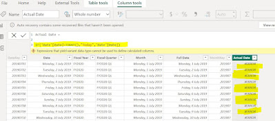
So I thought of creating a new column named Actual Date in my Date table.  So I created as below.


The formula I used was an IF statement,  

Actual Date = IF('Date'[Date]=TODAY(),"Today",'Date'[Date])

But this resulted in an error.  When you closely look at the formula I have written, you may notice that the output is in two data types..  One is a Text data type which is Today and the other one is a Date which is a Date data type.


So I have now modified the formula as below to convert the date data type into a text data type.  Then the error is gone.

Actual Date = IF('Date'[Date]=TODAY(),"Today",'Date'[Date]&"")

Basically what the If statement is doing is -- If the Date is equal to Today's date then the text Today is going to be populated in the Actual Date column, otherwise the date is going to be populated as shown below.


Once you create the new column, create a slicer with the new column (Actual Date) and sort the data by descending and choose Today to default the slicer value.  

After this is done, you will notice that the slicer is always defaulted to Today.


You can follow a similar approach for Month as well.  


Need admin approval -- Azure webapp message

Challenge encountered :  Today one of my colleague could not access a webapp that I have created in our Azure Tenant.  The error is as follo...